covidregionaldatagraphs
Sub-national COVID graphs for France
Introduction
These plots are prepared using covidregionaldata to download data published by French Public Open Data Platform.
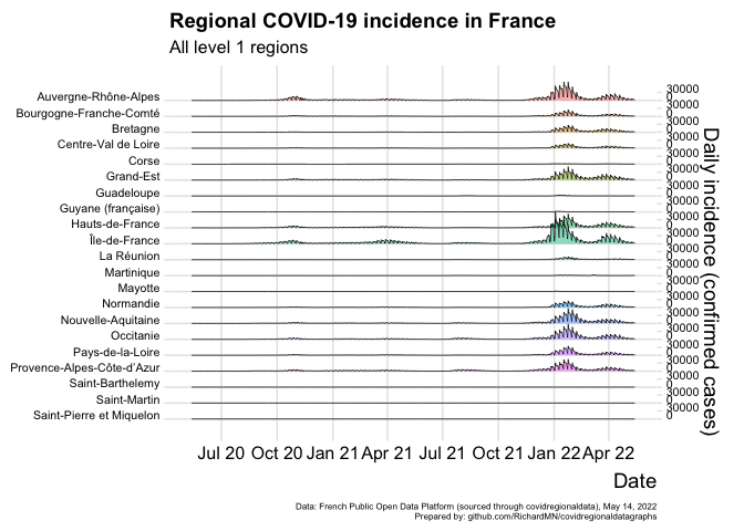
Plot ridgeline incidence for all level 1 regions
Ridgeline graphs allow for comparison of the incidence in different regions side by side. These are not per capita calculations but just the daily incidence. There is no smoothing, so weekly variations and gaps in testing or reporting due to weekends or holidays are visible.
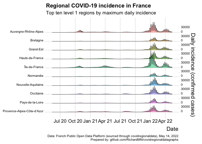
Plot ridgeline incidence for top 10 level 1 regions
Where there are many level 1 regions, the top 10 regions are displayed.
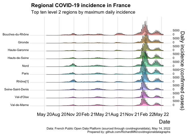
Plot ridgeline incidence for top 10 level 2 regions
The top 10 level 2 regions are shown.
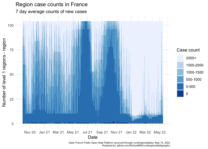
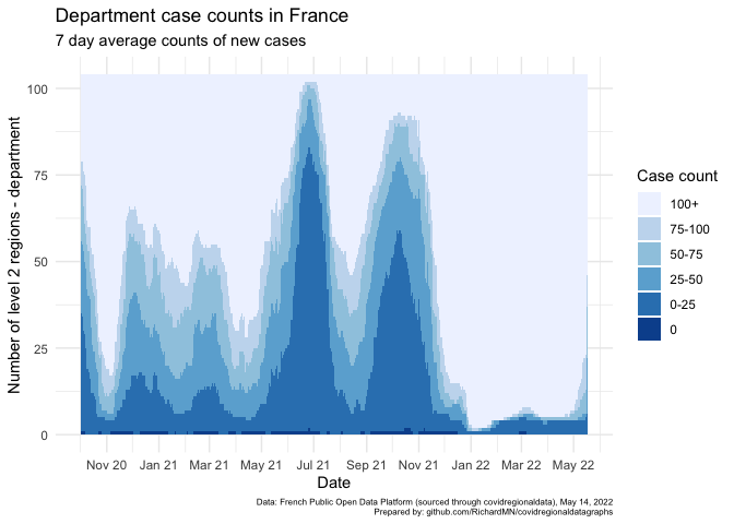
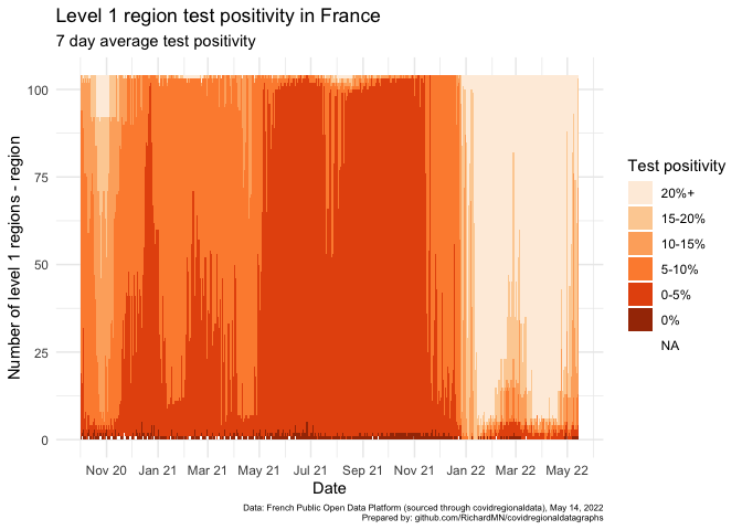
The following charts are a form of aggregated heatmap. They are a stacked column display of the number of regions for each country with average weekly incidence falling into certain ranges. This gives an overview of how concentrated a shift in the data may be, but masks variation as to which regions are being more or less impacted from week to week.
Waterfall chart case counts - level 1
Waterfall chart case counts - level 2
Plotting these charts for level 2 regions typically shows smoother curves.
Waterfall chart level 1 region test positivity
This proxy for test positivity is calculated by comparing the number of new cases each day with the number of tests taken each day.
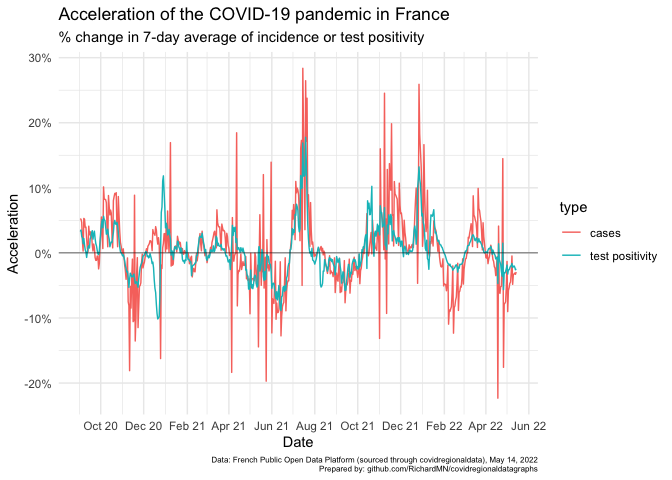
Acceleration calculations - national
This acceleration calculation is made based on a proxy for test positivity calculated by comparing the number of new cases each day with the number of tests taken each day.