Data source
These charts are drawn using data published by the Official Statistics Portal (OSP) on their COVID-19 open data site, along with the annual population counts for Lithuanian municipalities, also published by the OSP.
The R markdown source is available as a github repo.
Show code
age_bands_municipalities <- tibble(lt_aggregate) %>%
#  select(-object_id) %>%
  mutate(date = as_date(date)) %>%
  group_by(municipality_name, date, age_gr) %>%
  summarise(across(where(is.numeric), ~ sum(.x, na.rm=TRUE))) %>%
  ungroup()

age_bands <- age_bands_municipalities %>%
  group_by(date, age_gr) %>%
  summarise(across(where(is.numeric), ~ sum(.x, na.rm=TRUE)))

natl_age_data <-  lt_age_sex_data %>%
  filter( location == "Total" ) %>%
  select(-location) %>%
  pivot_longer(
    cols = !"total",
    values_to = "count",
    names_to = "age_range") %>%
  mutate_if(is.character, str_remove_all, pattern = "\\d+[^\\d]") %>%
  mutate(age_range = as.numeric(age_range)) %>%
  mutate(age_range = replace_na(age_range, 85)) %>%
  mutate(cohort = cut(age_range,
                      c(0, 9, 19, 29, 39, 49, 59, 69, 79, 89 ),
                      c("0-9", "10-19", "20-29", "30-39", "40-49", "50-59", "60-69", "70-79", "80+"),
                      include.lowest = TRUE)) %>%
  select(-age_range,-total) %>%
  group_by(cohort) %>%
  summarise(count = sum(count))

lt_age_data <- lt_age_sex_data %>%
  filter(grepl("mun.$", location)) %>%
  pivot_longer(
    cols = !c("location","total"),
    values_to = "count",
    names_to = "age range") %>%
  mutate_if(is.character, str_replace_all, pattern = " mun.", replacement = "")
age_band_factors <- age_bands %>%
  mutate(cohort = case_when(
    age_gr == "80-89" ~ "80+",
    age_gr == "90-99" ~ "80+",
    age_gr == "Centenarianai" ~ "80+",
    age_gr == "Nenustatyta" ~ NA_character_,
    TRUE ~ age_gr
  )) %>%
  filter(!is.na(cohort)) %>%
  select(-age_gr) %>%
  group_by(date, cohort) %>%
  summarise(across(where(is.numeric), ~ sum(.x, na.rm=TRUE))) %>%
  ungroup()

per_capita_rates <- left_join(age_band_factors, natl_age_data, by = c("cohort")) %>%
  mutate(population = count,
         cases_per_100k = new_cases / count * 100000,
         deaths_all_per_mill = deaths_all / count * 1000000) %>%
  select(-count)
Show code
colourCount = length(unique(age_bands$age_gr))
getPalette = colorRampPalette(brewer.pal(8, "Set2"))

age_bands %>%
  group_by(age_gr) %>%
  mutate(cases_7d = zoo::rollmean(new_cases,k=7, fill=NA) ) %>%
  ungroup() %>%
  filter(date > ymd("2021-08-01")) %>%
  ggplot(aes(x = date, y=cases_7d, fill=age_gr)) +
  theme_minimal() +
  #geom_col(width=1, position = position_stack(reverse = TRUE)) +
  geom_area() +
  #scale_fill_brewer(palette = "Set2") +
  scale_fill_viridis_d(
    name = "Age cohort",
    #option = "inferno",
    breaks = c("0-9", "10-19", "20-29", "30-39", "40-49", "50-59", "60-69",
               "70-79", "80-89", "90-99", "Centenarianai",  "Nenustatyta"),
    labels = c("0-9", "10-19", "20-29", "30-39", "40-49", "50-59", "60-69",
               "70-79", "80-89", "90-99", "100+",  "Unknown"),
    direction = 1
  ) +
  scale_y_continuous(sec.axis = dup_axis()) +
  labs(title="Lithuania - COVID-19 cases by age group",
       subtitle="7 day rolling average",
       y="New cases",
       x="Date",
       caption=caption_text) +
  scale_x_date()
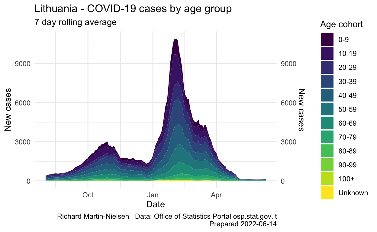
These charts are inspired by the narrow age cohort graph given by the OSP on their pandemic illustrations page:

Because the age cohorts given in the two sources used do not align, when calculating COVID rates relative to age cohorts, a smaller number of larger cohorts is used. It is also possible to extend the graph further back into 2021.
Show code
pc_rate_14d <-
  per_capita_rates %>%
  group_by(cohort) %>%
  mutate(pc_cases_14d = zoo::rollsum(cases_per_100k,k=14, fill=NA, align="right") ) %>%
  ungroup() %>%
  filter(date >= ymd("2021-09-01"))

ntl_rate_14d <- per_capita_rates %>%
  group_by(date) %>%
  summarise(across(where(is.numeric), ~ sum(.x, na.rm=TRUE))) %>%
  mutate(cases_per_100k = new_cases / population * 100000,
         deaths_all_per_mill = deaths_all / population * 1000000) %>%
  mutate(pc_cases_14d = zoo::rollsum(cases_per_100k,k=14, fill=NA, align="right") ) %>%
  filter(date >= ymd("2021-09-01"))
pc_rate_14d %>%
  ggplot(aes(x = date, y=pc_cases_14d, colour=cohort)) +
  theme_minimal() +
  theme( legend.position = "none") +
  geom_line(size=1) +
  geom_line(data = ntl_rate_14d, aes(x=date, y=pc_cases_14d),
            linetype = 2, colour="black") +
  geom_text_repel(aes(x=date,y=pc_cases_14d,label=cohort,colour=cohort),
                  nudge_x=10,
                  direction="y",hjust="left",
                  data=tail(pc_rate_14d, 9)) +
  geom_text_repel(aes(x=date,y=pc_cases_14d,label="National"),
                  colour="black",
                  nudge_y=1000,
                  hjust="right",
                  data=ntl_rate_14d %>% filter(date == "2022-01-01")) +
  #scale_fill_brewer(palette = "Set2") +
  scale_colour_viridis_d(name = "Age cohort") +
  scale_y_continuous() +
  labs(title="Lithuania - COVID-19 cases by age group",
       subtitle="14 day cumulative per 100,000",
       y="New cases",
       x="Date",
       caption=caption_text) +
  scale_x_date(expand = expansion(add=c(0,25)))
Show code
pc_rate_7d <- per_capita_rates %>%
  group_by(cohort) %>%
  mutate(pc_cases_7d_mean = zoo::rollmean(cases_per_100k,k=7, fill=NA, align="right") ) %>%
  ungroup() %>%
  filter(date >= ymd("2021-09-01"))

ntl_rate_7d <- per_capita_rates %>%
  group_by(date) %>%
  summarise(across(where(is.numeric), ~ sum(.x, na.rm=TRUE))) %>%
  mutate(cases_per_100k = new_cases / population * 100000,
         deaths_all_per_mill = deaths_all / population * 1000000) %>%
  mutate(pc_cases_7d_mean = zoo::rollmean(cases_per_100k,k=7, fill=NA, align="right") ) %>%
    filter(date >= ymd("2021-09-01"))
pc_rate_7d %>%
  ggplot(aes(x = date, y=pc_cases_7d_mean, colour=cohort)) +
  theme_minimal() +
  theme( legend.position = "none") +
  geom_line(size=1) +
  geom_line(data = ntl_rate_7d, aes(x=date, y=pc_cases_7d_mean),
            linetype = 2,
            colour="black") +
  geom_text_repel(aes(x=date,y=pc_cases_7d_mean,label=cohort,colour=cohort),
                  nudge_x=20,
                  direction="y",hjust="left",
                  data=tail(pc_rate_7d, 9)) +
  geom_text_repel(aes(x=date,y=pc_cases_7d_mean,label="National"),
                  colour="black",
                  nudge_y=60,
                  hjust="left",
                  data=ntl_rate_7d %>% filter(date == "2021-11-15")) +
  #scale_fill_brewer(palette = "Set2") +
  scale_colour_viridis_d(name = "Age cohort") +
  scale_y_continuous() +
  labs(title="Lithuania - COVID-19 cases by age group",
       subtitle="7 day rolling average per 100,000",
       y="New cases",
       x="Date",
       caption=caption_text) +
  scale_x_date(expand = expansion(add=c(0,15)))
Show code
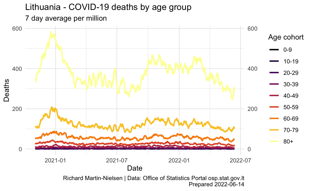
per_capita_rates %>%
  group_by(cohort) %>%
  mutate(pc_deaths_7d_mean = zoo::rollmean(deaths_all_per_mill,k=7, fill=0, align="right") ) %>%
  ungroup() %>%
  filter(date > ymd("2020-11-01")) %>%
  ggplot(aes(x = date, y=pc_deaths_7d_mean, colour=cohort)) +
  theme_minimal() +
  geom_line(size=1) +
  #scale_fill_brewer(palette = "Set2") +
  scale_colour_viridis_d(name = "Age cohort", option = "inferno") +
  scale_y_continuous(sec.axis = sec_axis(~ .)) +
  labs(title="Lithuania - COVID-19 deaths by age group",
       subtitle="7 day average per million",
       y="Deaths",
       x="Date",
       caption=caption_text) +
  scale_x_date()